IconTV
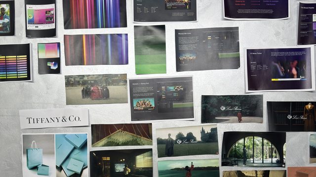
Competitor audit (MyDay, TV Line), the core audience — Tashkent, 25–45, income $1,500+, 60/40 men to women — personas, and a SWOT before a single logo was drawn.
“IconTV — a space of premium attention.” Insight: exclusive audience = exclusive content + exclusive advertising. Archetypes 70% Ruler, 30% Creator; a tone of voice with rules, examples and channel adjustments.
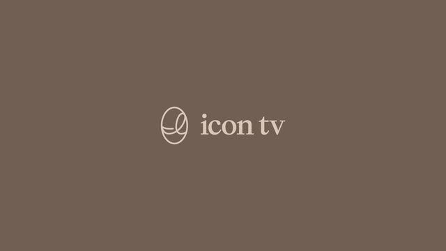
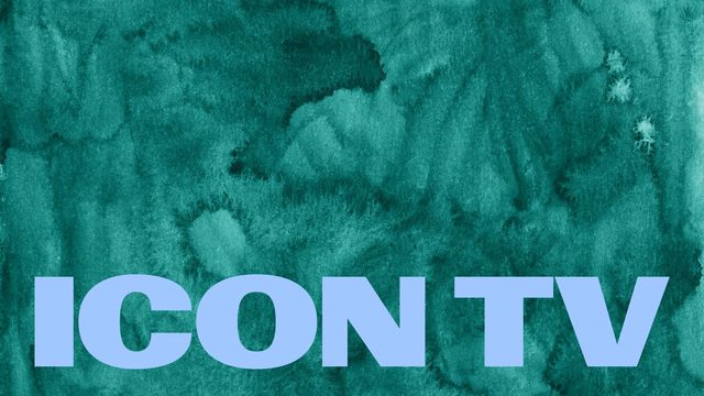
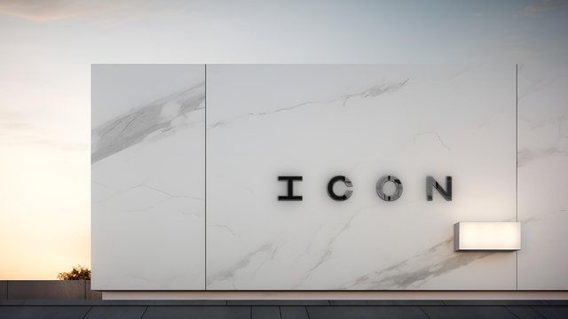
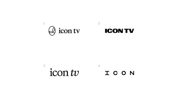
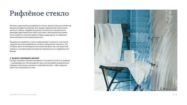
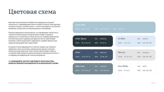
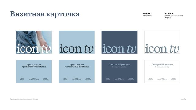
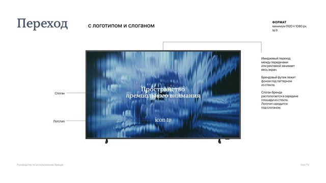
Four complete visual worlds, each shown on real carriers — screens, signage, app icon, merch. The client chose the third: a serif wordmark with an italic “tv” and fluted glass as the brand’s signature texture.
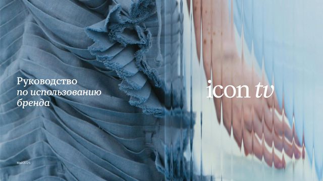
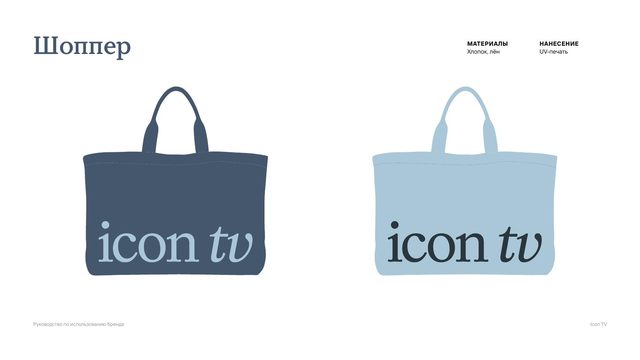
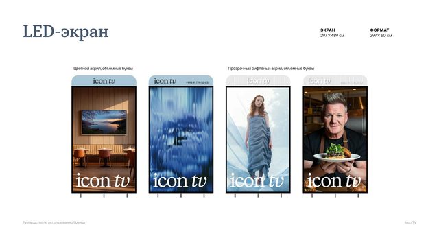
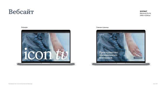
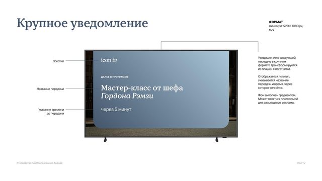
A 63-page brand book: logo, colour, type, stationery, merch, billboards, LED, social, app, website — and the on-air system: logo bug, notifications, transitions, partner cards, lower thirds, subtitles. Plus the logo animation.
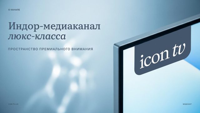
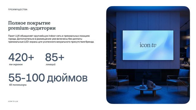
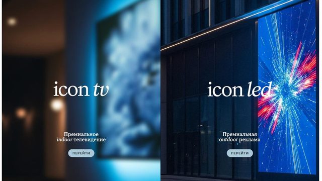
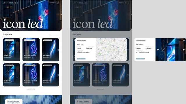
The identity grew into a family: icon led for premium LED screens and icon co. as the umbrella. We designed the icon led website — a high-fidelity prototype with a location catalogue, map and booking cart — the icon tv / icon led welcome page, and the ICON TV LUX media kit that sells the network to advertisers.